1. ArchDaily
  2. Beauty

Beauty: The Latest Architecture and News

Subscriber Access

Synthesis of the Arts: The Case for Beauty in Architecture and the City

Audio available

This article is part of "Thresholds", a special edition printed newspaper by Cobe Notes x ArchDaily.

Post–World War I modernism broke sharply with historicist and neoclassical traditions, stripping buildings of ornamentation and historical or religious reference to focus on priorities, clarity, and efficiency. Architecture embraced rationality and social reform, while art moved in the opposite direction, exploring self-expression, experimentation, and freedom from academic conventions.

This tension between objective order and subjective perception has defined a threshold between the arts evident in contemporary architectural practices, where personal intuition increasingly gives way to measurable facts. Is our pursuit of answers, facts, and truths distancing us from something fundamentally human: questions, doubt, and ambiguity? The answer may lie in public, building-integrated art, a practice that sits precisely at that threshold, and asks practitioners in architecture and urban design to trust values that resist direct measurement.

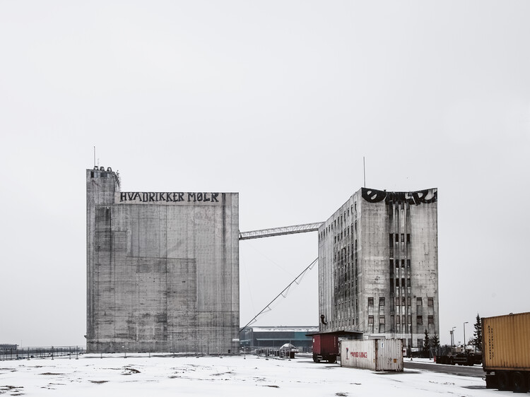
Synthesis of the Arts: The Case for Beauty in Architecture and the City - Image 1 of 4Synthesis of the Arts: The Case for Beauty in Architecture and the City - Image 2 of 4Synthesis of the Arts: The Case for Beauty in Architecture and the City - Image 3 of 4Synthesis of the Arts: The Case for Beauty in Architecture and the City - Image 4 of 4Synthesis of the Arts: The Case for Beauty in Architecture and the City - More Images+ 1

Subscriber Access

Pink as a Design Tool: Atmosphere, Identity, and Experimentation in Interior Design

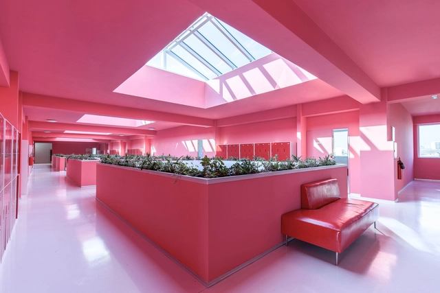
In recent years, pink has evolved beyond its traditional associations to become a sophisticated and versatile element in architecture and interior design. Defined by a broad spectrum of shades, pink encompasses both warm and cool tones, ranging from pure red tints (R) to blends with yellow (Y80R, Y90R) or blue (R10B, R20B, R30B), as classified by the Natural Color System (NCS). While difficult to define by a single shade, this color balances vibrancy and softness, making it adaptable across different materials and contexts. As pink continues to gain prominence in contemporary interiors, its role extends beyond being a mere color choice—it is a design strategy. The recent transition from the bold, playful pinks of the "Barbiecore" trend to softer, powdery hues seen in fashion and design in 2025 fashion collections, highlights the color's adaptability. Its presence in Pantone's 2025 color palettes, also reinforces its appeal across disciplines. When applied thoughtfully, pink can transform spaces, making them feel inviting, expansive, or timeless.

Pink as a Design Tool: Atmosphere, Identity, and Experimentation in Interior Design - Image 2 of 4Pink as a Design Tool: Atmosphere, Identity, and Experimentation in Interior Design - Image 4 of 4Pink as a Design Tool: Atmosphere, Identity, and Experimentation in Interior Design - Image 1 of 4Pink as a Design Tool: Atmosphere, Identity, and Experimentation in Interior Design - Image 5 of 4Pink as a Design Tool: Atmosphere, Identity, and Experimentation in Interior Design - More Images+ 7

Beauty Salon Shin Enom / Shintaro Takeda Design Office

Beauty Salon Shin Enom / Shintaro Takeda Design Office - Interior Photography, Retail Interiors, Facade, BeamBeauty Salon Shin Enom / Shintaro Takeda Design Office - Interior Photography, Retail Interiors, Facade, BeamBeauty Salon Shin Enom / Shintaro Takeda Design Office - Interior Photography, Retail Interiors, Door, Facade, ChairBeauty Salon Shin Enom / Shintaro Takeda Design Office - Interior Photography, Retail Interiors, Door, Facade, ChairBeauty Salon Shin Enom / Shintaro Takeda Design Office - More Images+ 11

What is Beauty in Architecture Today - and Are We Afraid of it?

This article was originally published on CommonEdge as "The 'B' Word: How a More Universal Concept of Beauty Can Reshape Architecture."

Subscriber Access

Why do Beautiful Things Make us Happy - And Why Does Modernism Make us Sad?

A recent exhibition at the MAK Vienna - Austrian Museum of Applied Arts / Contemporary Art, is showcasing the works of Sagmeister & Walsh, a NYC-based design firm investigating what makes beauty so appealing.

Titled "Beauty," the exhibition explores the notion that beauty operates as an independent function, and that in itself, it can be the primary motive for architecture: form is a function. In collaboration with the YouTube channel and design studio Kurzgesagt (In A Nutshell), this video released along with the exhibition explains why beautiful things make us happy.

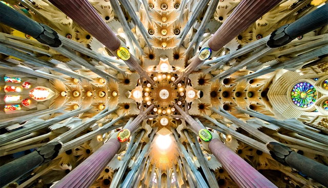
Why do Beautiful Things Make us Happy - And Why Does Modernism Make us Sad? - Imagen 1 de 4Why do Beautiful Things Make us Happy - And Why Does Modernism Make us Sad? - Imagen 2 de 4Why do Beautiful Things Make us Happy - And Why Does Modernism Make us Sad? - Imagen 3 de 4Why do Beautiful Things Make us Happy - And Why Does Modernism Make us Sad? - Imagen 4 de 4Why do Beautiful Things Make us Happy - And Why Does Modernism Make us Sad? - More Images+ 1