It is said that when Le Corbusier arrived in Greece, he was struck by its architecture—the Hellenistic temples, their regulating system of proportions, and their monochromia. Many of these elements went on to influence his work. What would have surprised the architect, however, is that Greek temples were actually not monochromatic; in fact, they were far from it. Blue, red, green, and even gold: these were the vibrant colors that enveloped Greek buildings. Friezes, pediments, colonnades, and even sculptures—every inch was coated in color derived from pigments. The passage of time, wars, exposure to the sun, rain, and wind, along with the perishable nature of the pigments, caused the surfaces to fade, leaving the cold marble exposed.

This polychromatic awakening of the classical world was discovered only a few years ago, thanks to the work of many scientists, mainly the research of Volkmar von Graeve and Vinzenz Brinkmann. It is difficult to dissociate the image of the Parthenon from the whiteness of its stone, or to think of the Acropolis as a land of vibrant colors. Considering that classical architecture has influenced artistic production from the Renaissance to the present day, one cannot help but wonder: what would architecture look like today if the color had endured? Would the paradigms be different?

Today, few architects dare to experiment with color. Bold projects appear from time to time, but white seems to dominate the scene. While white certainly has its advantages, what about the rest of the chromatic spectrum? Can we design without white?

In Argentina, while the chromatic palette has not always been used to its full extent, there are several examples where facades and walls left white neutrality behind to explore other alternatives. Let's look at some of them.
The Colors of La Boca: The City's Port Neighborhood
Near the Riachuelo river lies the neighborhood of La Boca, located in the south of the City of Buenos Aires. When European immigrants arrived in the country in search of a better future at the beginning of the 20th century, many settled in this area.

Using corrugated metal sheets and wood, they built their homes and painted them in various colors: red, blue, yellow, green, orange, and light blue. A single facade could easily feature more than five colors. This wide range of colors is believed to be because the houses were painted using leftover paint from ships.

In 1928, the area known today as Caminito was closed down and subsequently deteriorated significantly. However, in the 1930s, the renowned painter Benito Quinquela Martín set to work and began his mission to revive his beloved neighborhood. He purchased plots of land and donated them to establish schools, museums, art galleries, and other institutions.

In the 1950s, with the help of several neighbors, he inaugurated Caminito—an open-air art museum and a space for exhibitions by artists and artisans. He intervened on the facades, restoring their joy and color, converting that abandoned railway stretch into what is now considered one of the country's most popular cultural sites.

Casa Rosada: Symbol of Unity or Technical Consequence?
There are several theories regarding the use of the pink color on the Government House. One considers the color a distinctive and concrete symbol intended to convey a message, while the other sees it as a secondary consequence of a waterproofing measure.

Regarding the first theory, as graphic designers well know, the proper use of color is crucial for communication. Each color can help convey a specific message. In fact, the choice of colors in traffic lights or signage is no accident.

In this case, the pink color is a symbol of unity. It represents the blending of colors from opposing ideals: white, representing the Unitarian ideals, and red, representing the Federalist ideals. It was President Sarmiento who ordered the building painted pink to symbolize a bond of national unity.
The second theory responds to technical requirements. The pink color is the result of mixing lime with bovine blood, a substance that increased the lime's resistance to rain and humidity.

Clorindo Testa
One Argentine architect who certainly had no fear of color was Clorindo Testa. From the Naval Hospital to the Universidad del Salvador, the architect designed a city with all the colors of the rainbow. These are some of his most recognized works:

Centro Cultural Recoleta

Museo del Libro y la Lengua

Casa La Tumbona

Campus Universidad del Salvador

Central Park in Barracas
What once was Argentina's largest printing company now houses the office and studio complex known as Central Park. In 1996, renovation and adaptive reuse works began. One of the most iconic changes in this transition was moving away from monotonous facades in search of an explosion of color.
The task fell to Pérez Celis, one of the country's most respected visual artists, whose work has been exhibited worldwide. True to his style, Celis democratized art, bringing his work to the facades to make it accessible to the entire community.

The Terrace Palace by Antonio Bonet, Roberto Luna, Raúl Fernández, and Alejandro Zamudio
In some cases, color is used in small amounts as a way to emphasize details. Located in Mar del Plata, the Terrace Palace is a building that keeps the colors of the Bauhaus alive.

Espacio Infancia. Galpón Estudio
Others, like Espacio Infancia by Galpón Estudio, are instead clear examples of ephemeral architecture defined by pure color.

Gongo Store. Christian Schlatter
Breaking the stereotypes of commercial architecture is the work of Christian Schlatter at the iconic Gongo Store.

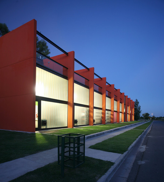
Ateliers at Ciudad de las Artes. GGMPU Arquitectos + Lucio Morini
The Ciudad de las Artes houses 10 ateliers in a building where color was used as a catalyst for creativity and originality.
Mastering the use of color is perhaps one of the most difficult skills to develop for an architect or an artist. With color, we can expand or reduce a space, create atmospheres, and cause light to reflect or be absorbed. Its selection must be conscious and deliberate. As Ernst Neufert once said:
We live in a full-color world; why shouldn't architecture be the same? After all, what would we be without the deep blue of Van Gogh or the unforgettable pink of Barragán?
This article was written by Mariana Etulain. The translation is powered by AI.