
The 2026 Color of the Year selections show a shift toward nuanced, layered palettes and understated spatial calm, moving beyond the saturated earth tones of previous forecasts. Pantone's Cloud Dancer, a soft white, sets a foundation of clarity and simplicity, while Sherwin-Williams and C2 Paint highlight the versatility of mid-tone neutrals and soft ochres, emphasizing material authenticity and adaptability across different interior surfaces and lighting conditions. Benjamin Moore and Graham & Brown explore deeper, atmospheric hues that balance warm and cool undertones, and Behr, Valspar, and AkzoNobel introduce muted greens and blue-based tones aimed at creating restorative, composed, and visually engaging interiors.
Benjamin Moore: Silhouette AF-655
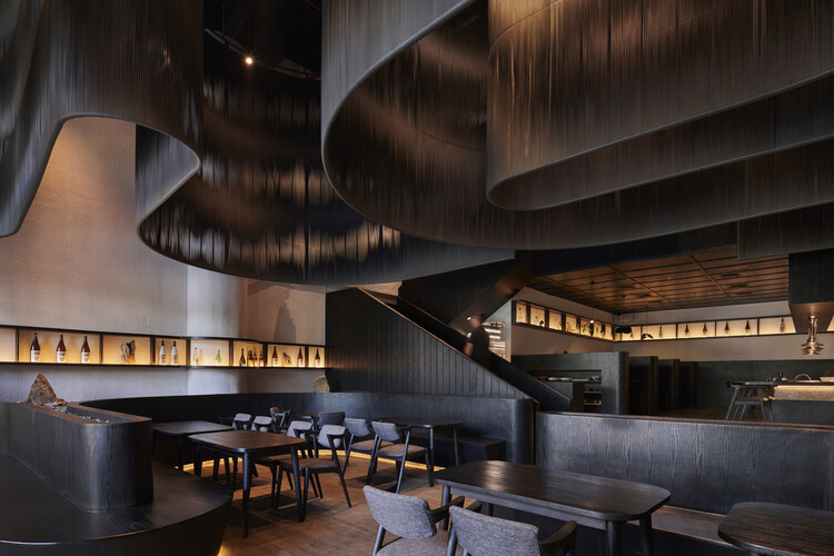
As part of its Color Trends 2026 palette, Benjamin Moore has named Silhouette AF-655 for the Color of the Year. The shade combines burnt umber with charcoal notes, resulting in a dark tone that sits between warm and cool registers. Positioned alongside pale and midtone hues, Silhouette AF-655 contributes to a palette structured around tonal balance and contrast. The broader selection references established color traditions and material awareness, bringing together hues that range from lightly lifted to deeply grounded.
Graham & Brown: Divine Damson
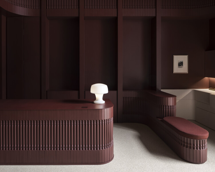
For 2026, Graham & Brown has announced Divine Damson as its Colour of the Year, introduced to accompany the Design of the Year Eternal Weave and the Eternal City mural. The colour is a deep damson shade inspired by the tones of ripe damson and fig, with layered undertones that reveal notes of mulberry and garnet as light conditions change. Defined by its depth and warmth, Divine Damson is intended for use across a variety of interior settings.
C2 Paint: C2 Epernay #639
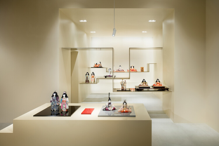
C2 Paint has selected Epernay #639 as its Color of the Year for 2026, a soft ochre defined by muted mineral undertones. The color references historical European interiors, where pale yellow hues were commonly used for their warmth, adaptability, and association with natural materials. Reintroduced in a contemporary context, Epernay reflects renewed interest in craft, material authenticity, and tactile surfaces. The selection forms part of C2's 2026 En Terre palette, which centers on earth-derived hues informed by weathered architecture, natural fibers, and cultivated landscapes.
Behr: Hidden Gem
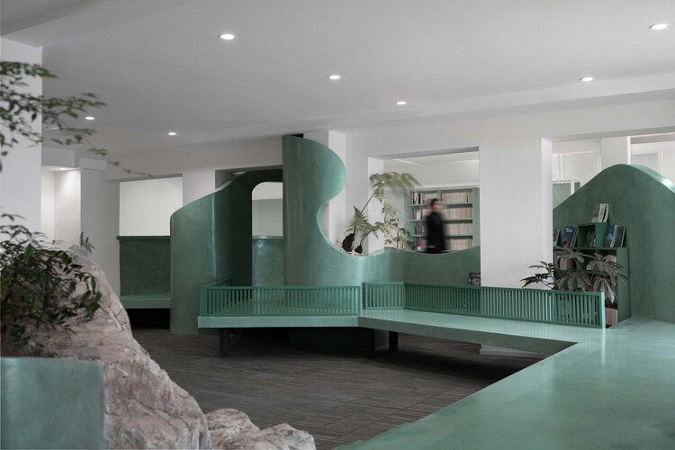
Behr's selection, Hidden Gem, as its Color of the Year, is a muted smoky jade, combining green and blue undertones that produce subtle shifts in appearance under changing light conditions. Its mid-depth tone allows it to be applied across interior walls, architectural elements, and furnishings, depending on finish selection, including flat and satin. Hidden Gem also serves as a reference point for Behr's 2026 Color Trends palette, which comprises warm neutrals, mid-tones, and accent colors organized to support varied interior styles and layered color compositions.
AkzoNobel: Rhythm of Blues
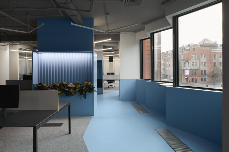
AkzoNobel's Colors of the Year for 2026 are presented under the title Rhythm of Blues, a trio of blue-based shades developed through the Global Aesthetic Center's annual trend forecast. The palette includes Mellow Flow, a light blue; Slow Swing, a darker tone; and Free Groove, a more saturated variant, together addressing a range of spatial conditions from restrained environments to those with greater visual intensity. The selection is informed by research conducted with architects, designers, and trend specialists, situating the colors within broader material and design trends.
Valspar: Warm Eucalyptus
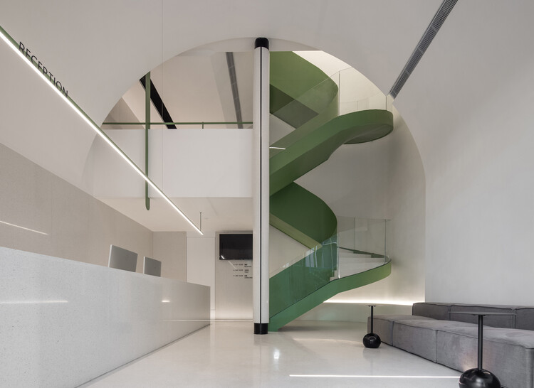
Valspar has selected Warm Eucalyptus (8004-28F) as its Color of the Year for 2026, a muted green with warm undertones positioned between neutral and nature-inspired palettes. The color reflects an ongoing interest in restorative and mindful interior environments, where subdued hues are used to establish calm and visual continuity. The selection is supported by coordinating colors such as Degas Blue and Groundbreaking, which introduce cooler and darker notes to create balanced, grounded compositions aligned with contemporary residential design trends that emphasize flexibility, material warmth, and blurred indoor–outdoor boundaries.
Sherwin Williams: Universal Khaki SW 6150
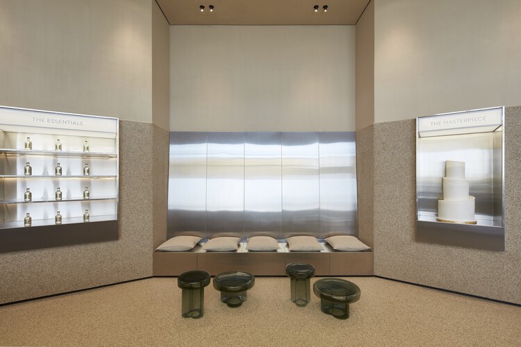
Sherwin-Williams has selected Universal Khaki (SW 6150), a mid-tone neutral that is defined by warm, earthy undertones and a subtle yellow bias, positioning it as a versatile base across a wide range of interior contexts. Referencing natural materials and understated architectural finishes, Universal Khaki is intended to support long-term use rather than seasonal application, functioning equally well alongside light neutrals, darker accents, or more saturated colors. The selection reflects an ongoing emphasis on durability, adaptability, and restraint in residential and commercial interiors, where neutral palettes are used to create continuity across spaces and surfaces.


